

DUAS MÃOS — Soluções em Escrita
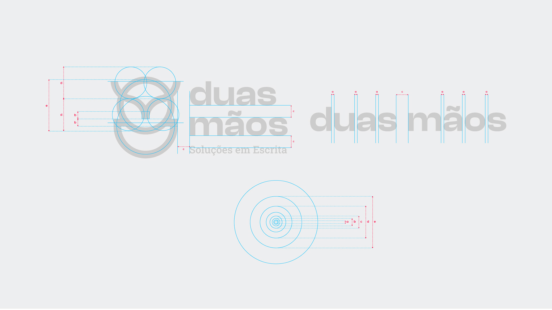
Identidade Visual
© 2021
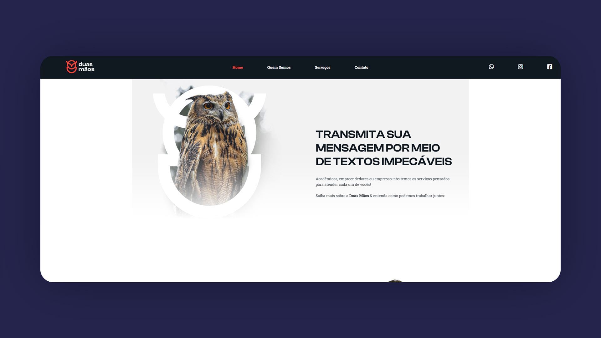
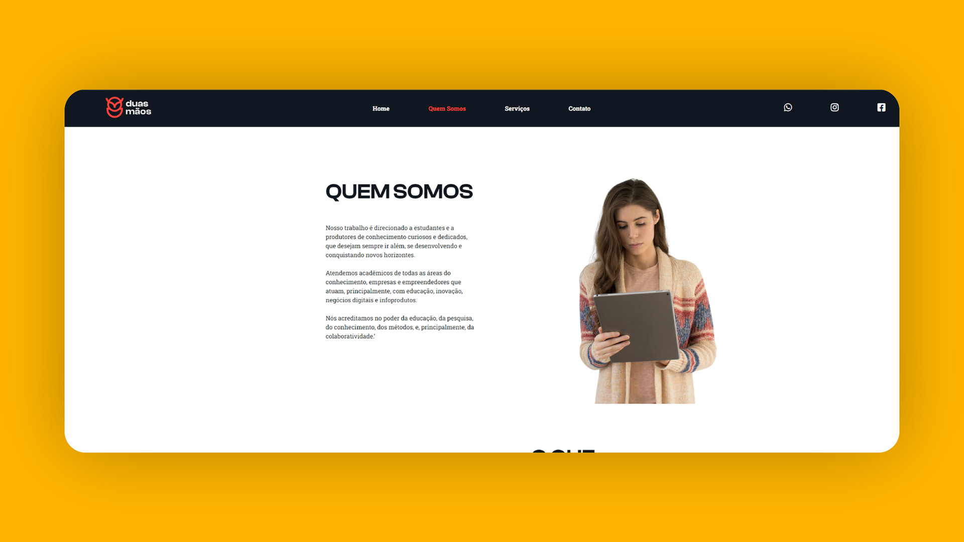
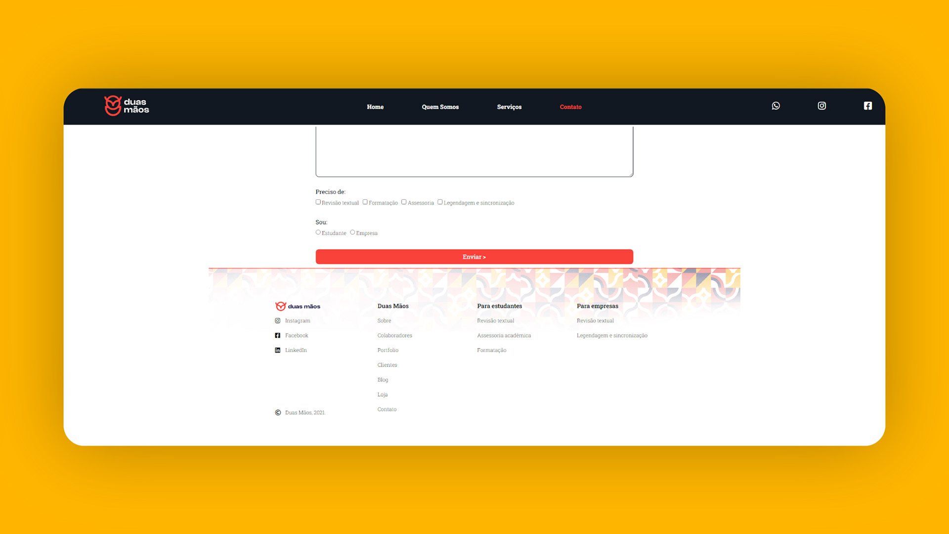
A Duas Mãos oferece serviços de revisão textual, formatação ABNT e mentorias individuais para auxiliar alunos de graduação, pós, mestrado e doutorado no desenvolvimento dos seus trabalhos.
Para empresas e empreendedores, também realiza revisão textual para relatórios, infoprodutos e diversos materiais escritos, além de legendagem e sincronização de audiovisual.
A marca busca tornar-se, também, uma Escola de Escrita Acadêmica, através da produção de cursos e e-books que instruem, auxiliam e abrem caminhos para uma pesquisa mais leve, prática, com profundidade e qualidade.
[ENG]
Duas Mãos offers proofreading, ABNT formatting and individual mentoring services to help undergraduate, graduate, masters and doctoral students in the development of their work.
For companies and entrepreneurs, they also do proofreading for reports, infoproducts and various written materials, as well as subtitling and audiovisual synchronization.
The brand also seeks to become an Academic Writing School, through the production of courses and e-books that instruct, assist and open paths for lighter, practical, in-depth and quality research.
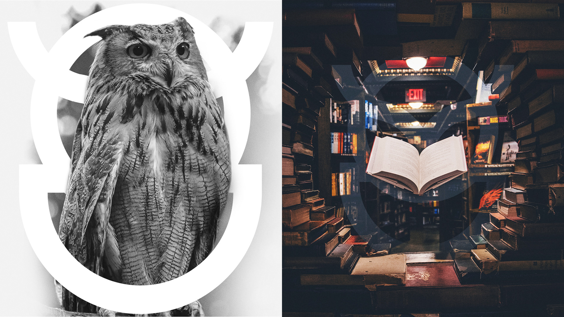

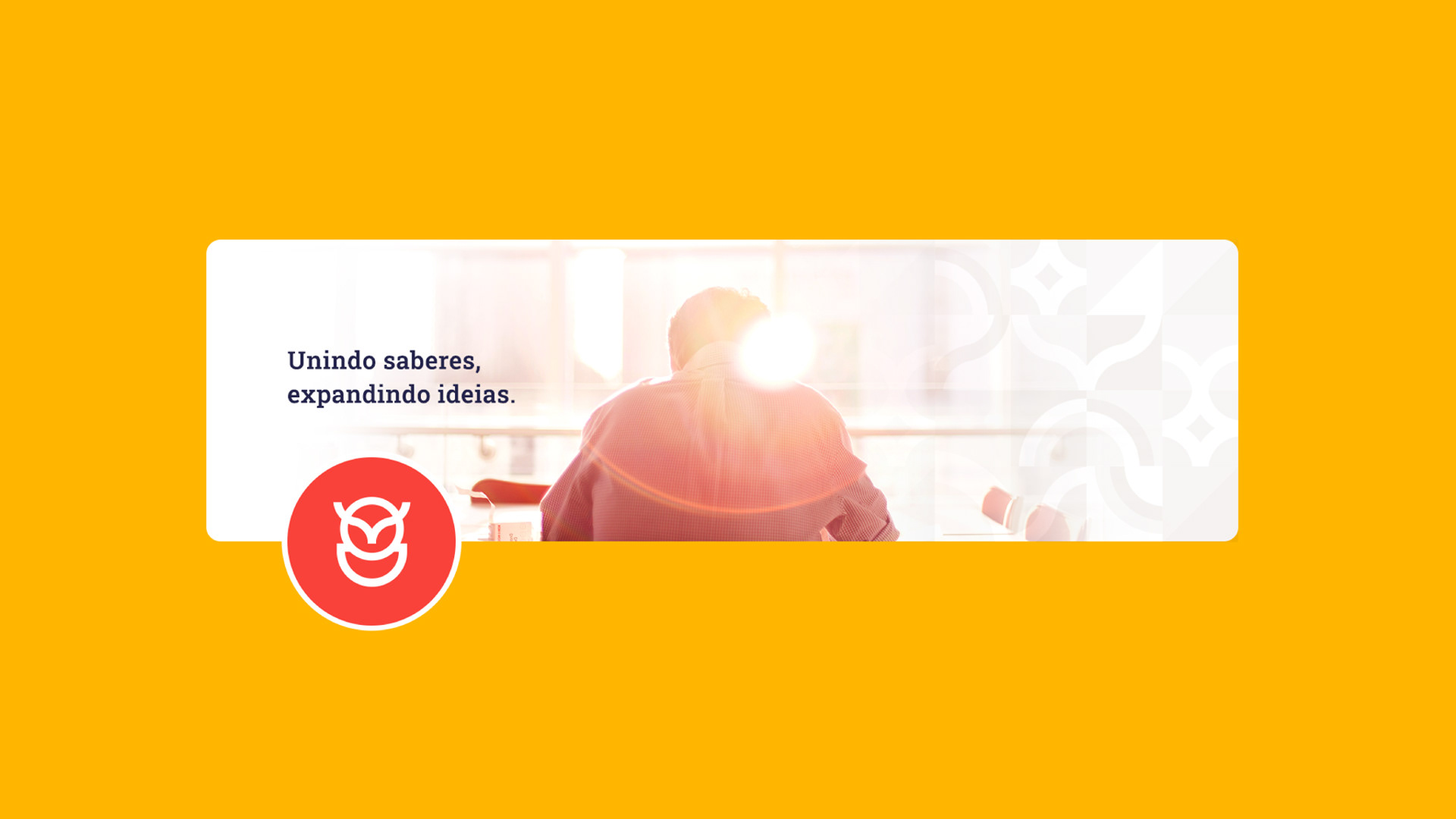
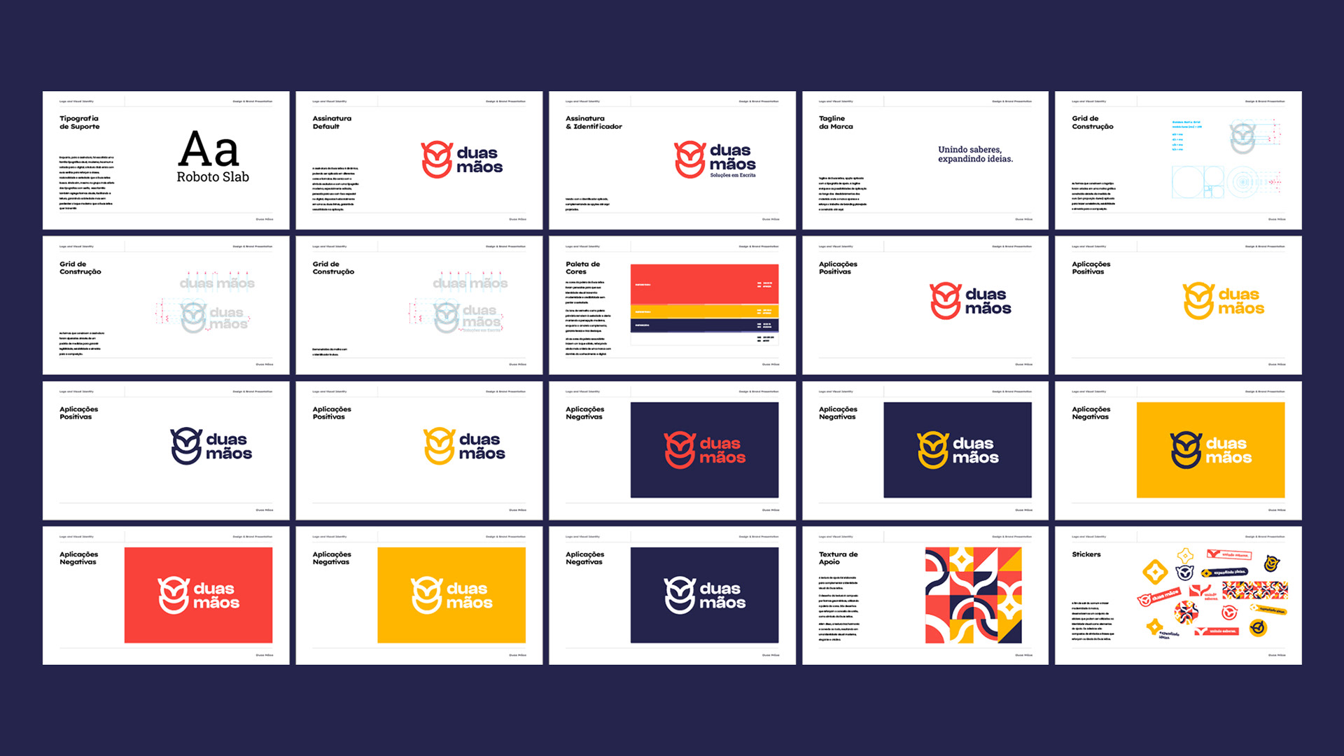
Os cinco elementos do logo representam o ecossistema da Duas Mãos, trabalhando juntos em harmonia. O elemento maior, representado pela coruja, resgata a percepção do conhecimento e sabedoria, enquanto os outros quatro elementos representam a presença da língua portuguesa junto ao acolhimento do otimismo e da atenção dedicada ao indivíduo em seu contexto.
[ENG]
The five elements of the logo represent the Duas Mãos ecosystem, working together in harmony. The largest element, represented by the owl, rescues the perception of knowledge and wisdom, while the other four elements represent the presence of the Portuguese language together with the welcoming of optimism and the attention dedicated to the individual in their context.
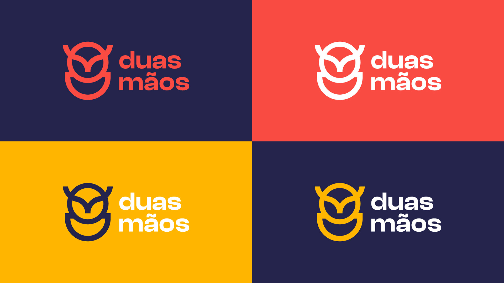
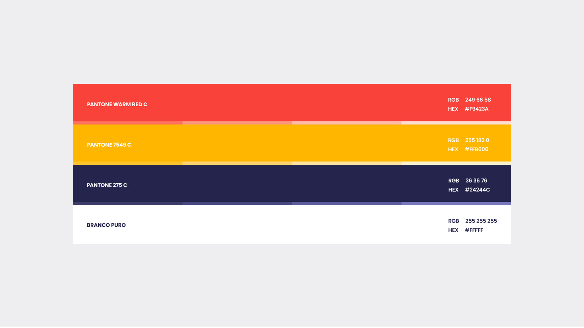
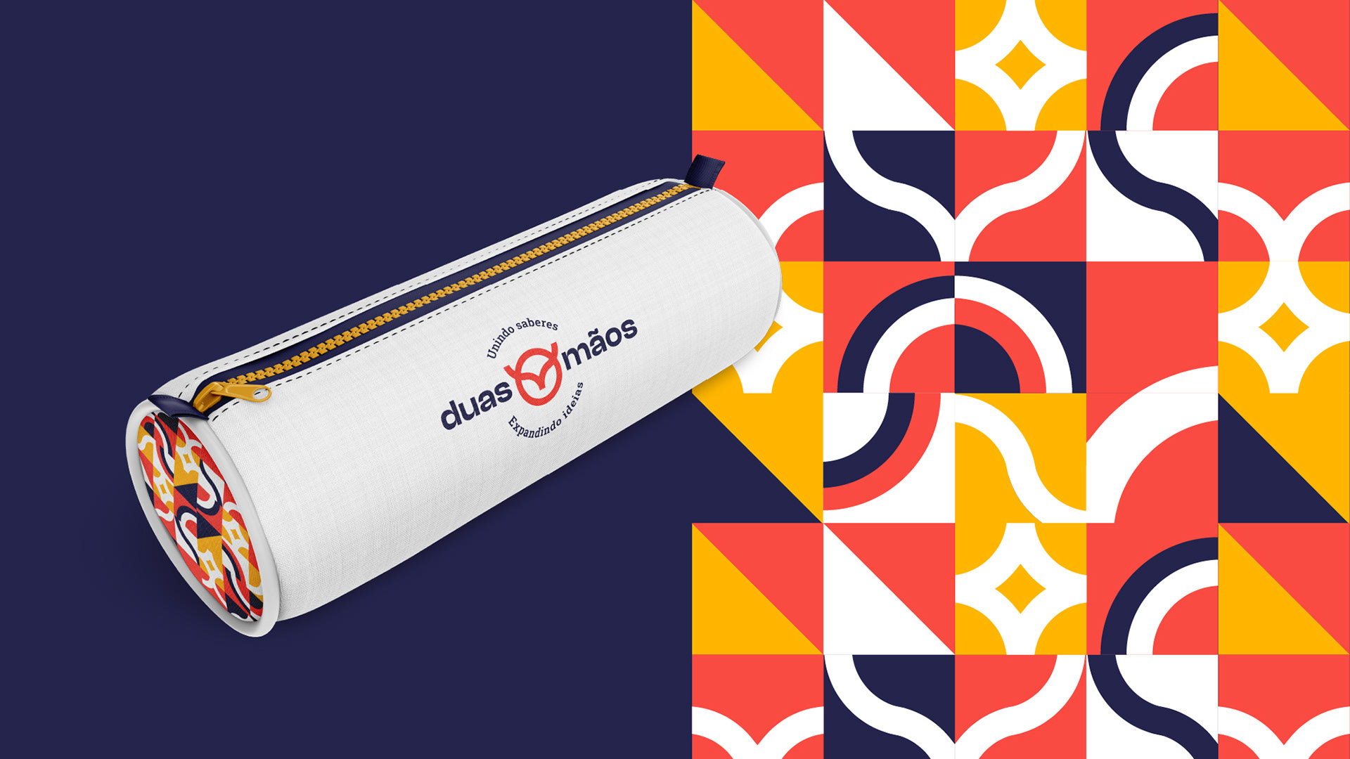
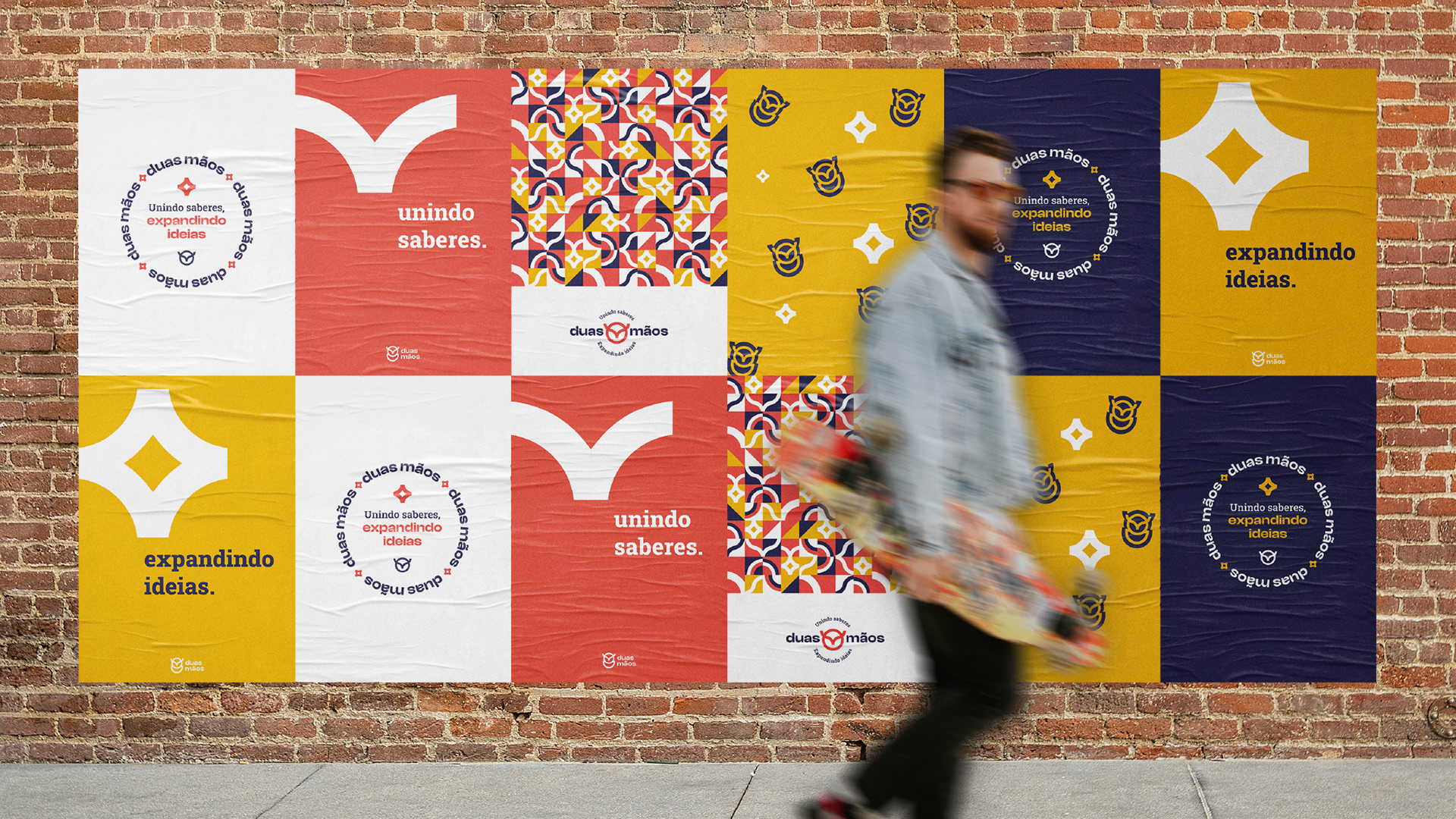
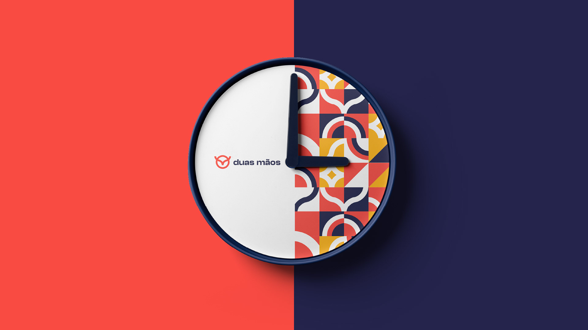
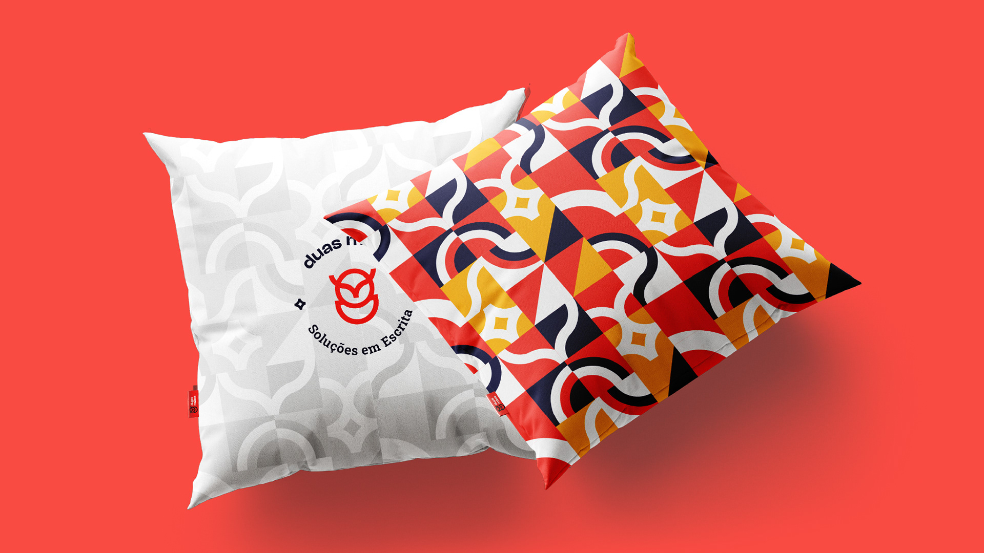
As cores da paleta da Duas Mãos foram pensadas para que sua identidade visual transmita modernidade e credibilidade sem perder a seriedade. Os tons de vermelho como paleta primária remetem à seriedade e ao alerta mantendo a percepção moderna, enquanto o amarelo complementa, garante leveza e traz destaque. Já o azul escuro, junto do branco puro, trazem um toque sóbrio, reforçando ainda mais a ideia de uma marca com domínio do conhecimento e do digital.
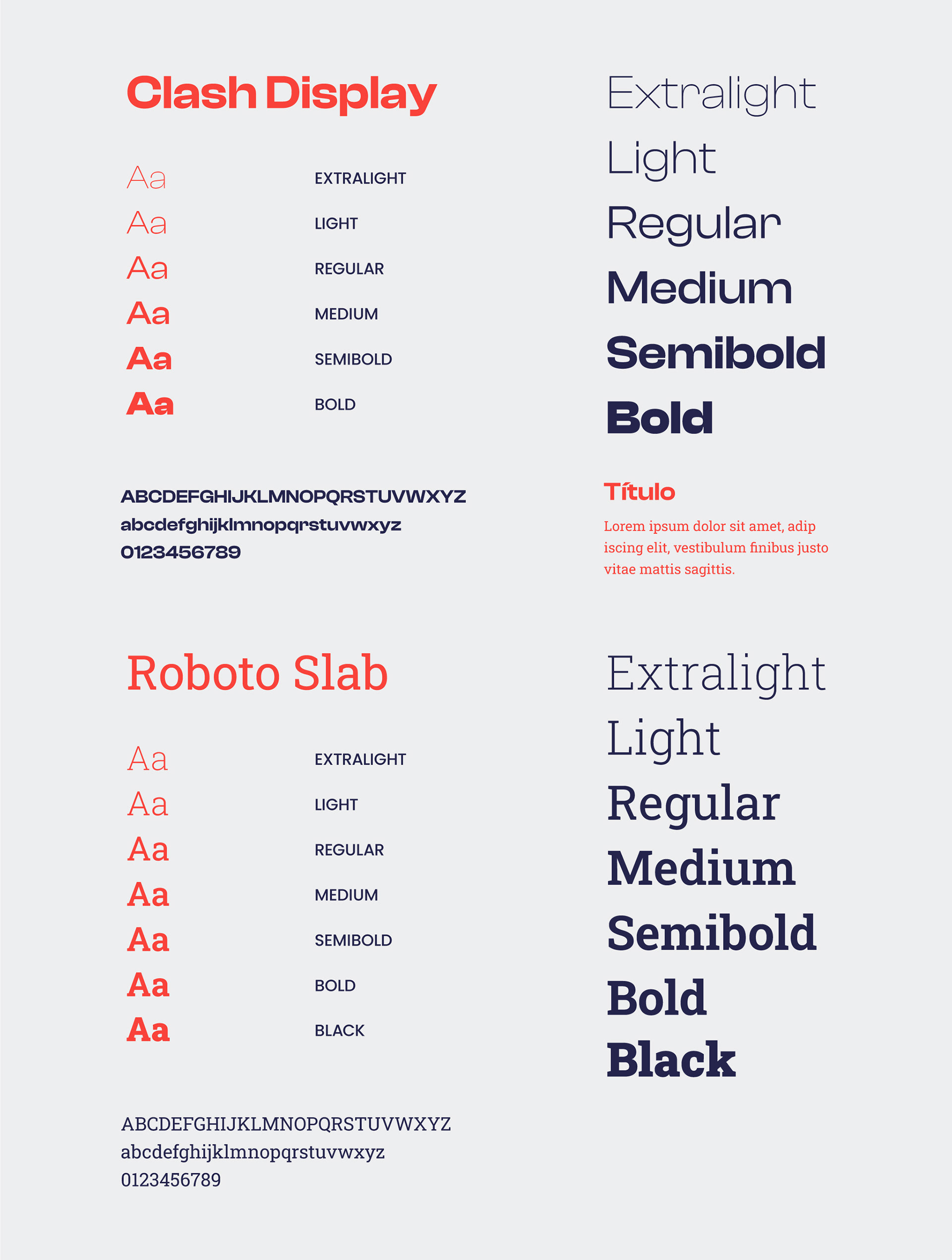
Enquanto, para a assinatura, foi escolhida uma família tipográfica atual, moderna, incomum e voltada para o digital, a Roboto Slab entra com suas serifas para reforçar a classe, racionalidade e seriedade que a Duas Mãos busca. Ainda sim, mesmo no grupo mais sóbrio das tipografias com serifa, essa família também agrega formas atuais, facilitando a leitura, garantindo sobriedade mas sem perder o toque moderno que a Duas Mãos quer transmitir.
[ENG]
The colors of the Duas Mãos palette were designed so that its visual identity conveys modernity and credibility without losing seriousness. The shades of red as the primary color refer to seriousness and attention while maintaining a modern perception, while yellow complements, ensures lightness and brings emphasis. Dark blue, together with pure white, bring a sober touch, further reinforcing the idea of a brand that focuses on knowledge and on the digital domain.
A modern, unusual and digital-oriented typeface was chosen for the signature. Roboto Slab uses its serifs to reinforce the elegance, rationality and seriousness that Duas Mãos seeks. Even so, even in the most sober group of serif typographies, this family also brings together current forms, making it easier to read, ensuring sobriety but without losing the modern touch that Duas Mãos wants to convey.


Direção de Arte e Design: Braz
Pesquisa e Branding: Andressa Amorim
Web Design: Gabriel Soldatelli
Follow me in Instagram
Obrigado por estar aqui!
Thanks for being here!